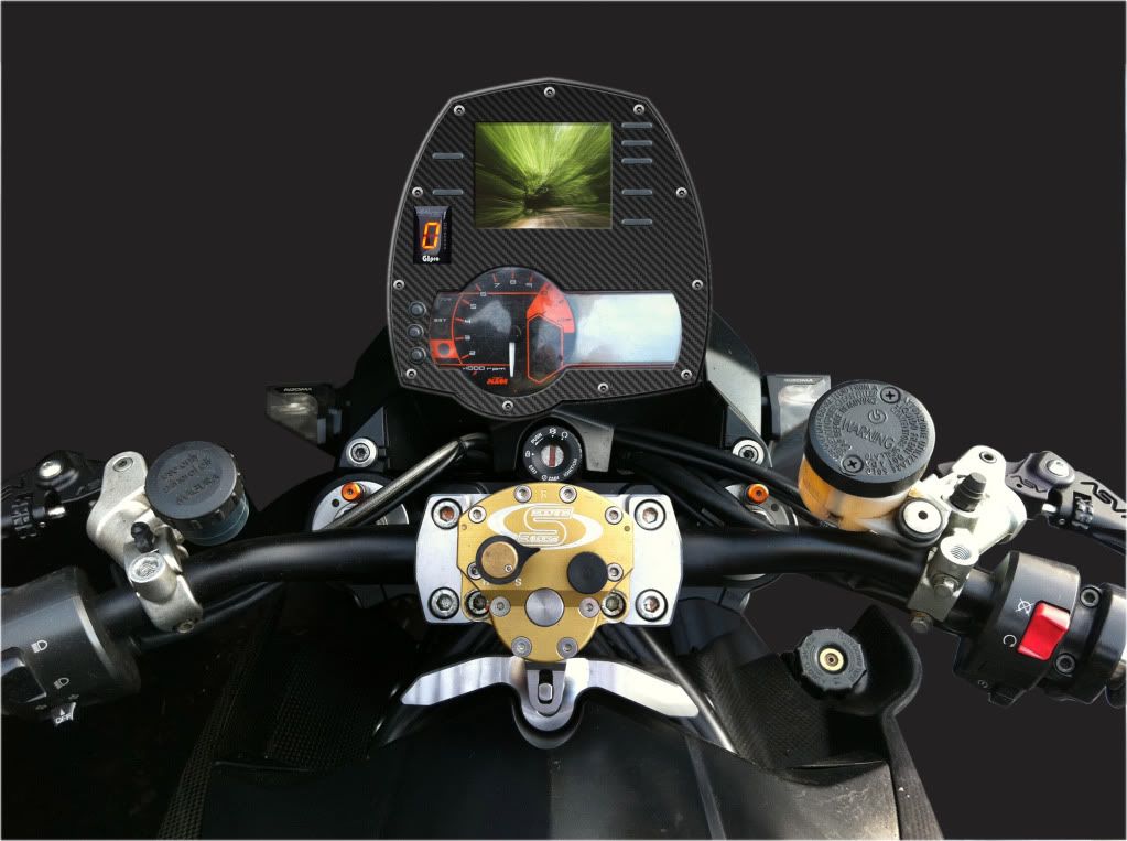
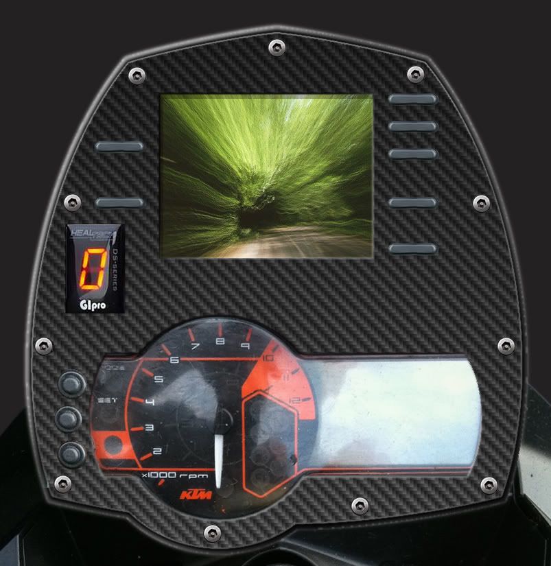
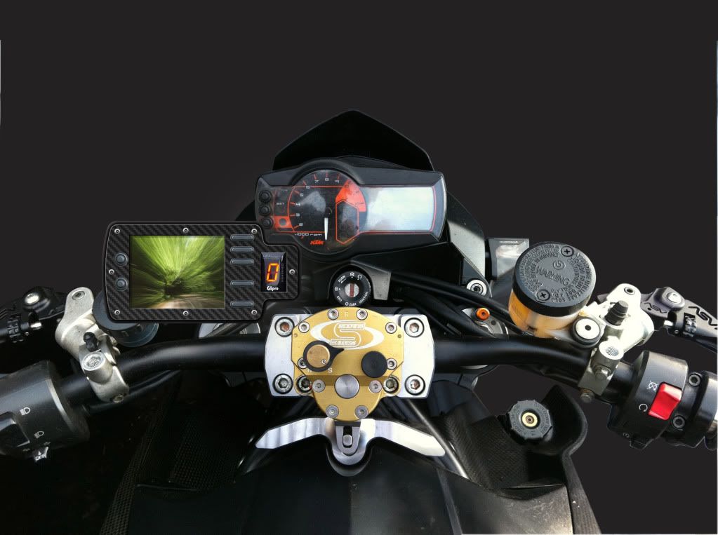
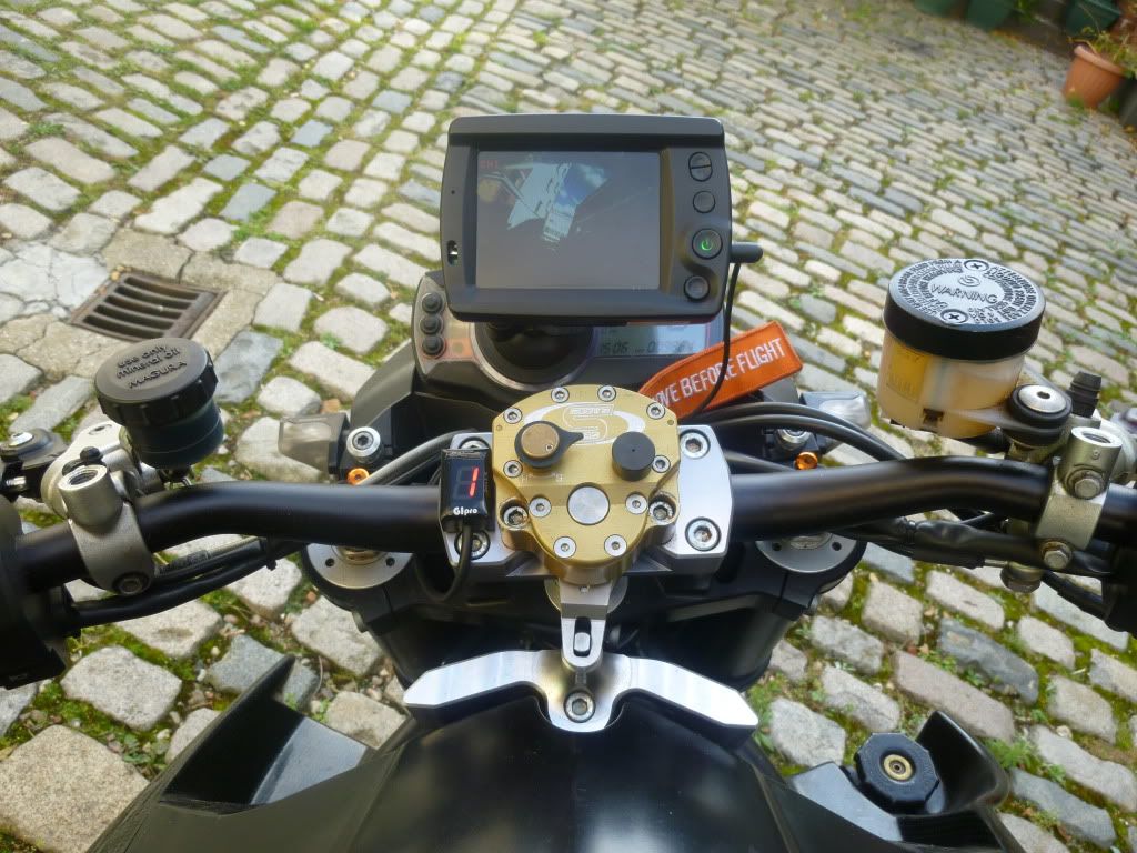
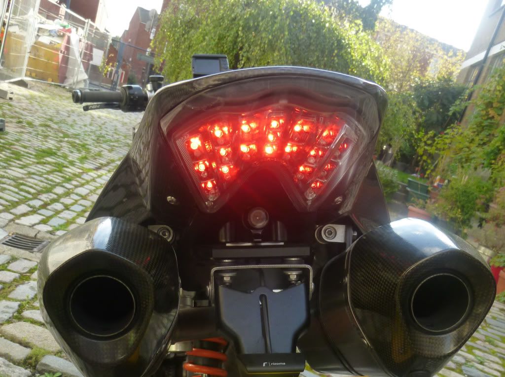
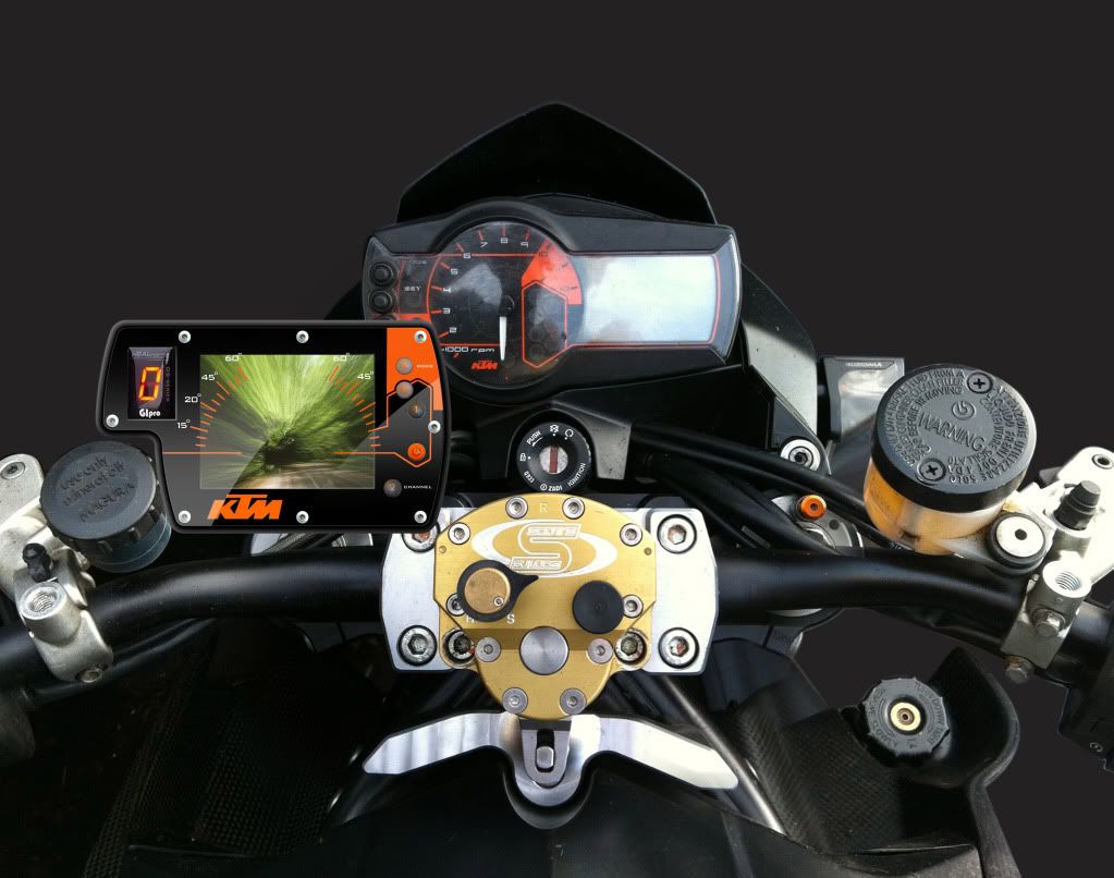
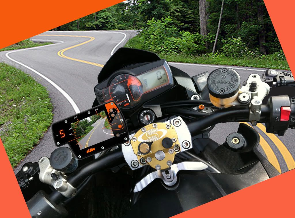
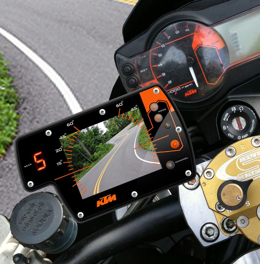
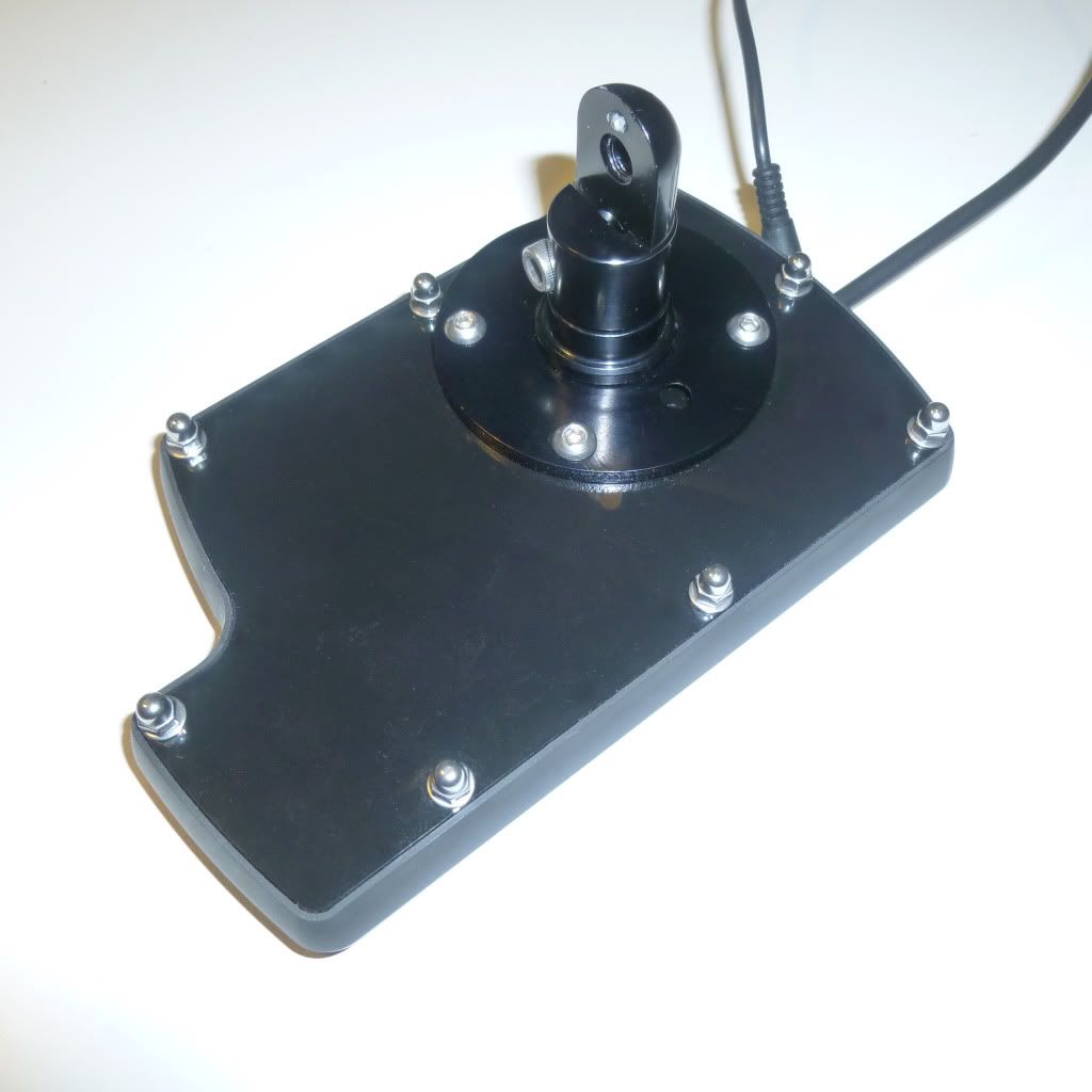
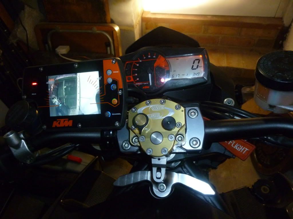
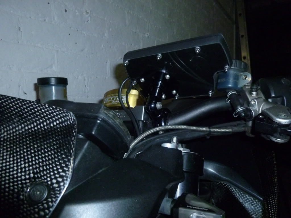
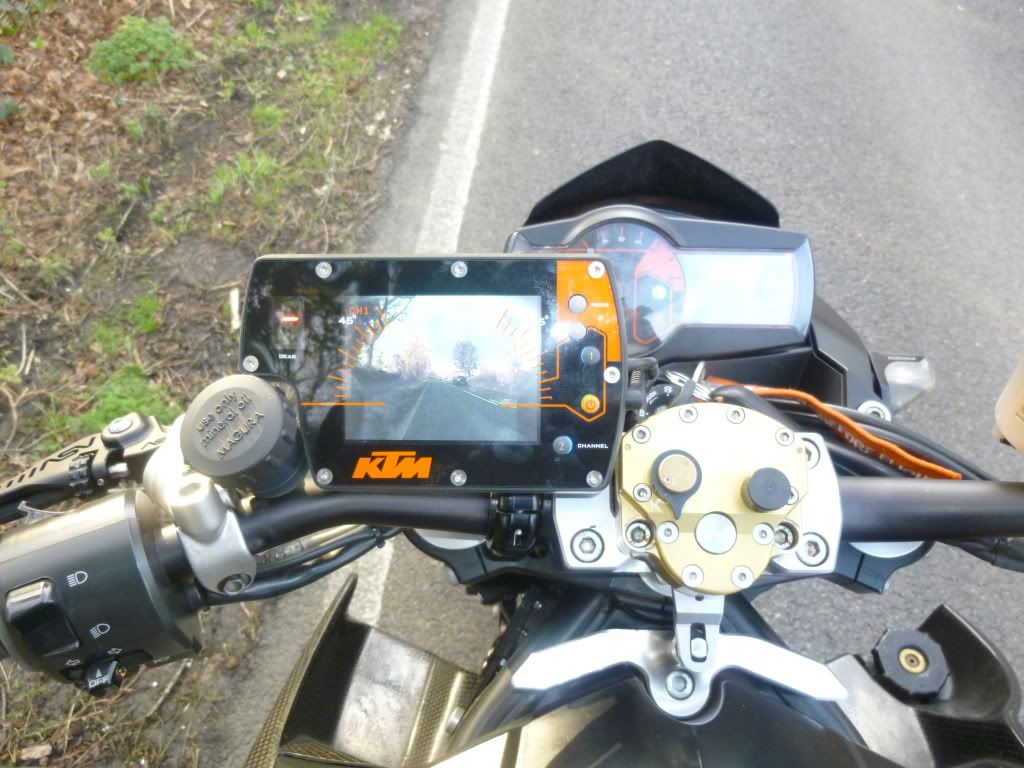
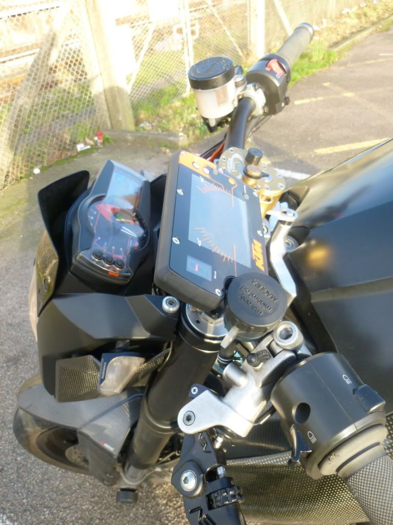
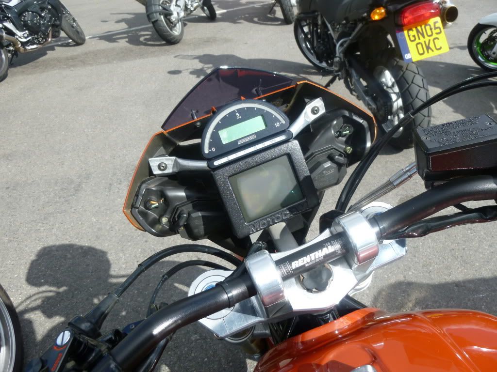
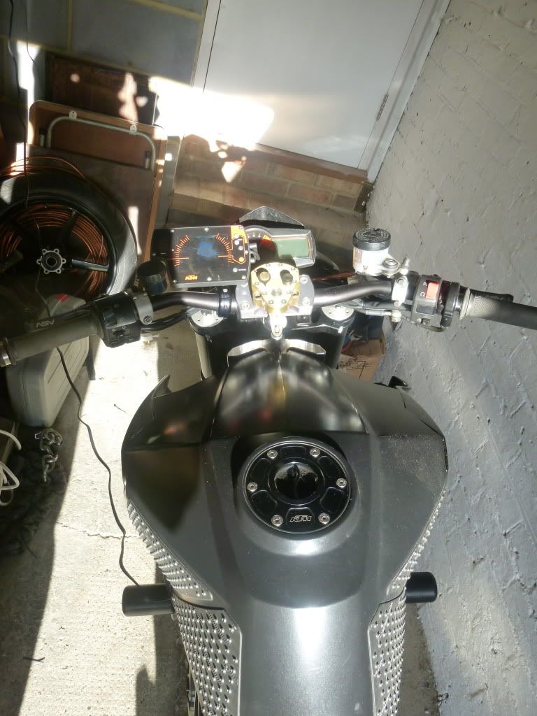
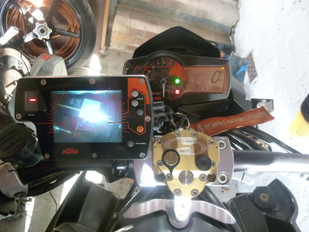
I was toying with the idea of doing away with my mirrors by trying out a rear mounted camera hidden under the tail tidy connected to a small screen mounted next to the clocks. I hate the mirrors on bikes - always look better when they are off for track-days. And they don't work very well anyway - most of what I see is elbows unless I pull my arm in. SD mirrors don't vibrate much but the image you get in them is not that great. Some bike's I've owned the mirrors are totally useless. I had my LC4 without mirrors on for 5 years and just looked over my shoulders.
Anyway, I just found this site selling a small kit. Does anyone know of any problems with this principle?
http://www.4kam.com/bikeeye_wireless_re ... camera.htm
I know legality might be one. I think the camera is no problem - it's running a live screen whilst riding that might be an issue. Although Sat nav. screens and modern displays must allow this law to be seriously disputed if it ever came to court.
What about vibration? A wildly shaking image would not be good for a check check behind you.
And what about light sensitivity and stuff, (riding away from a sun set etc.) would this be any worse than real mirrors? I don't have a GoPro or other cams so have no experience with lenses and light sensitivity etc.
What about the lens type? Will it not have enough peripheral vision to be any good?
Not sure why this technology has not been adopted by manufacturers. Is there a big problem I'm not aware of?
Any thoughts welcome.
Anyway, I just found this site selling a small kit. Does anyone know of any problems with this principle?
http://www.4kam.com/bikeeye_wireless_re ... camera.htm
I know legality might be one. I think the camera is no problem - it's running a live screen whilst riding that might be an issue. Although Sat nav. screens and modern displays must allow this law to be seriously disputed if it ever came to court.
What about vibration? A wildly shaking image would not be good for a check check behind you.
And what about light sensitivity and stuff, (riding away from a sun set etc.) would this be any worse than real mirrors? I don't have a GoPro or other cams so have no experience with lenses and light sensitivity etc.
What about the lens type? Will it not have enough peripheral vision to be any good?
Not sure why this technology has not been adopted by manufacturers. Is there a big problem I'm not aware of?
Any thoughts welcome.